

| Function reference | |


Arrange a single element in a panel with boxed title
obj = uiextras.BoxPanel( )UIPANEL
object. Where more than one child is added, the currently visible
child is determined using the SelectedChild property.obj = uiextras.BoxPanel( prop, value, ... )| Property | Value | Description |
|---|---|---|
BackgroundColor | colorspec | |
BeingDeleted | ||
Children | ||
CloseRequestFcn | function_handle | |
DeleteFcn | function_handle | |
DockFcn | ||
Enable | ||
FontAngle | ||
FontName | ||
FontSize | ||
FontUnits | ||
FontWeight | ||
ForegroundColor | colorspec | |
HelpFcn | ||
HighlightColor | colorspec | |
IsDocked | ||
IsMinimized | ||
MinimizeFcn | ||
Padding | ||
Parent | ||
Position | ||
SelectedChild | ||
ShadowColor | colorspec | |
Tag | ||
Title | ||
TitleColor | colorspec | |
Type | ||
Units | ||
Visible |
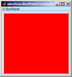
f =figure(); p =uiextras.BoxPanel('Parent', f,'Title', 'A BoxPanel','Padding', 5 );uicontrol('Parent', p,'Background','r')
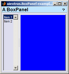
f =figure(); p =uiextras.BoxPanel('Parent', f,'Title', 'A BoxPanel','Padding', 5 ); b =uiextras.HBox('Parent', p,'Spacing', 5,'Padding', 5 );uicontrol( 'Style', 'listbox','Parent', b,'String', {'Item 1','Item 2'} );uicontrol('Parent', b,'Background','b');set( b,'Sizes', [100 -1] ); p.FontSize = 12; p.FontWeight = 'bold'; p.HelpFcn = @(x,y) disp('Help me!');
uiextras.Panel - for creating a more standard paneluiextras.TabPanel - for a panel with tabs for selecting the visible childuiextras.HBox - for creating a horizontal arrangement within a panel |
uiextras.CardPanel | [Top] | uiextras.TabPanel |  |